BCM111

Cultural crossing in Snowpiercer

Promotional poster for Snowpiercer, with Chris Evans

One day, I decided to watch the movie called Snowpiercer after seeing good reviews about it. Unaware that it had significant international involvement (Korean), I watched it for the plot premise. The movie is about people in the ‘tail’ section of the train, which houses the last remnants of humanity, as they fight their way up to the rich forward carriages. The film was applauded by critics for its plot and themes. Done by Korean Director Bong-Joon Ho, the main character is an American, Curtis (Played by Chris Evans),  but two other essential characters, Namgoong and Yona (Song Kang Ho and Go-Ahsung respectively), are Korean.

“More than 90% of the crew were either British or American, so everything went according to the American system. As a result, there were a lot of unfamiliar regulations and union rules to follow.”

This movie is a definite international mix, with this movie being based off a French graphic novel, Le Transperceneige. Snowpiercer is a South Korean-Czech Production, and 80% of the movie is in English. The other 20% is in Korean. Most of the staff and cast in this movie is a mix of white and Korean people, with cinematography by a Korean, and being edited by a white and Korean person. Bong Joon Ho also said ‘More than 90% of the crew were either British or American, so everything went according to the American system. As a result, there were a lot of unfamiliar regulations and union rules to follow.’

Namgoong, from the movie

Snowpiercer is a post-apocalyptic drama and an allusion to society. It is aimed at the English speaking audience and there is little knowledge needed for other cultures, as it is mostly English speaking. It is also aimed at Koreans too, with a Korean director and several Korean cast members in the movie. There is not really any cultural proximity needed, excepting Masons character (explained below), as it isn’t set in the current day, and only on a train.

There is some cultural knowledge needed for the film, as it caters to a Western audience already, and is set in a post-apocalyptic setting, where cultures are very much mixed together. One of the characters, Mason (played by Tilda Swinton) is very much a caricature of western political figures such as Margaret Thatcher and Hitler. Swinton also uses a Yorkshire Accent for the character, which English speakers would recognise as being distinctive and different from the rest of the cast while Koreans would not. Tilda Swinton suggested that her character have a British accent such as a Yorkshire accent, but Bong Joon Ho couldn’t tell the difference so they had to communicate this in a roundabout way.

Snowpiercer character Mason (Tilda Swinton), know for her distinctive style

There is alot of cultural diversity in this movie, and races and cultures are blended together, as these inhabitants are all stuck on a train. In Western cinema, it would be a foreign experience to see other languages spoken on screen, as well as a Korean director for a seemingly western movie. The movie and casting are different from how a usual western film would go, and is distinctive in this way. It is a hybrid production between two cultures. This is a production geared towards a Global North, as America (The West) and South Korea are in the Global North.

The global north (blue) and global south (red)

This movie does an excellent job at overcrossing the cultural divide, and having two different cultures and languages make one movie aimed for an audience. While Bong can understand some English, he is more comfortable with Korean, while the lead actor of Snowpiercer, Chris Evans, can only speak English, so that alone makes for an impressive cultural mix, as Bong Joon Ho would have needed to direct all of the actors. But in the end, the film came together, and received critical acclaim by critics, so I would say that despite all the differences, it was worth it to make this movie. This movie could also be considered as part of the Hallyu, the South Korean Governments push to export Korean entertainment to the world, as it has a Korean Director and actors.

VCD102

Idealising and Researching for my infographic

Its the first assessment task of the semester, and projects are starting. For VCD102, we are starting our data visualisation task. This involves defining and researching the product, according to the 7 Step Model by Ambrose and Harris.

When I first started the project, I had an idea in my head for an entertainment related concept. I tried finding out more information, but resources and data proved to be limited, and I had to scrap it and move on to other things.

Digital sketches of scrapped ideas I had for the Infographic

On a whim, I decided that I liked animals, and there were an abundance of resources that focused on animal data, so I would have plenty to choose from. I found a site for bird data, and I could search based on region and state. This was the perfect idea for a project, listing birds for the region of the Illawarra and comparing them to other statistics. However, I ran into a problem. I had originally wanted to list the top 10 most common birds in the Illawarra, and the top 10 rarest birds, but all of the rarest birds returned a sighting of 1, making them all equally rare, and a very boring data choice. I also thought the subject matter was a bit lacking, and I needed to find more stimulating statistics.

I then stumbled upon bird strikes, and I found a whole data sheet in Excel from the Australian Transportation Safety Board (ATSB) that provided me with more than enough information to use in an infographic. It had information on where and how many birds were struck by bird strikes. It also listed some ground animals that were struck by bird strikes. I now had a pretty good vision of how the data sets could be used, and how I would visualise it into an infographic.

A VERY fast sketch of my idea before I did any Illustrator work

The Wikipedia page and other subsequent resources were also a great help for more information on bird strikes to build a story, they had a lot of information on what they use to deter the birds, and during what seasons they’re active.

With help for the infographic, I looked up bird infographic (who would have thought?), and while most were a bit unhelpful, I did find an appealing colour scheme to work with (Also used in every movie poster ever!) and the iconic blue/orange combo still works.

How I decided what my colour scheme was going to be

I visualised a plane in the middle of the infographic, and putting data around or under it. I did this because I wanted to loosely imitate flight instruments in the cockpit that pilots use, such as an attitude indicator (also known as an artificial horizon), an instrument that tells your elevation and spatial relationship to the sky/ground.

An attitude indicator, a loose inspiration for my infographic

Research and defining the project went hand it hand. I could only define the project because I researched information for data sets and visual information, and with the knowledge that I was armed with, I could proceed to make prototypes!

BCM111

How to Train Your Dragon: The Hidden World Cultural Analysis (Scrapped Week 2 Post!)

I had seen the last two How to train your dragon movies, and while scrolling through Foxtel’s list of movies, I found the last movie in the trilogy and decided to watch The Hidden World. The synopsis of this movie is about a young adult called Hiccup and his dragon, Toothless, along with a whole dragon village, who decided to look for the Hidden World after dragon trappings, and to put the dragons in a safe place. This movie was made by DreamWorks Animation, and is a movie made and written in America. The intended audience was kids, teens and families, and people who had seen the last two How to train your dragon movies, so plot knowledge is also expected.

Promotional Poster for How To Train Your Dragon

The movie is set in a fantasy setting where there are dragons, and the village is based off Viking warriors, so previous knowledge of Vikings would make the story more enjoyable, as people understand that Berk, Hiccup’s village, is based off Viking stereotypes, such as drinking beer, horned helmets and long beards. The villagers also have a variety of Scottish and Scandinavian accents to play the part. And although very prominent and obvious in the story, basic knowledge of dragons is required, such as they breathe fire, have wings and so forth. While these are all very simple concepts for most of the Global North to know about without even thinking, it does require some cultural knowledge about Scandinavia and fantasy creatures that a person might not understand.

Global North (blue) and South (red)

The film also focuses on comedy, and relies on understanding some visual humour between two dragons, such as Toothless hanging down from a tree like a bat, or acting awkwardly. There is also spoken humour between characters. There is a chance that an audience not from the West may not understand the humour, as it is reliant on cultural boundaries and expectations.

How to train your dragon is made by the major animation studio DreamWorks, which is based in California and part of Hollywood. It definitely is made for a Global North, as it is an animation movie for kids and aimed a Western audiences, all of which are in the North. There is not much evidence for hybridisation of cultures in the movie, only Vikings, unless a fantasy friendship between dragons and humans count… Ah, If only dragons were real. But only as pets. No Game of Thrones behemoths please!

An example of an Asian Dragon, demonstrating different cultural fantasy creatures

For a person in the Global South, they might have different expectations of dragons, as there are many cultural stories like Asian Dragons, dragons that are snakes or a different depiction entirely. The cultural proximity for dragons in the West is very similar, all with common features of wings, lizard-like body, two or four legs. Anything else would likely be unfamiliar to Western audiences and they would struggle to realise it as a ‘dragon’. As a Westerner myself, How to train your dragon is a movie that falls in line with my own cultural expectations of how characters should act and the presentation of the world. It would be hard to interpret how the Global South took this movie, and if anything was misunderstood.

BCM114

Digital Artefact for BCM114!

So for my DA, I have decided to do an Instagram and Twitter based Art Profile called @AmelysArt. I will engage with my followers and see if I can curate my artworks for a certain audience and ask them what type of drawings, they prefer from me. I will evaluate my followers’ feedback through Instagram Polls and Twitter and see if there is a noticeable difference in activity when I draw in a certain style or when I draw humans or animals. I will post daily Instagram Stories for engagement and also post weekly memes on Twitter to check engagement. The purpose of this to make my profile more appealing to people so that they would want to follow my account, as well as share it with other people. I have had this account for around 4 years and interacting with followers will help me decide what direction to go next!

Account belongs to @toeribble on Instagram
Account belongs to @finchwing on Instagram

The two images above are examples of Instagram accounts that digital artists follow, and how their content is geared towards a more specific audience, such as ‘anime style’ art, or ‘cartoony animals’, that have an appeal to a certain group of people, rather than trying to do everything at once.

BCM111

Bath and Bim

That’s what the American version of Kath & Kim should have been called, unfortunately.

The original iconic Australian TV series Kath & Kim first aired on our screens in 2002 with our first look at this suburbia bogan-esque characters that were not grounded in reality and their antics surrounding it. This proved comedic for many Australians, and the show had a very successful run that ended in 2007 and even had a theatrical movie produced. Kath and Kim today are still known by the majority of Australians as a part of Australian culture. So how did the US get the adaptation so bizarrely wrong to Australians?

Kath & Kim Australian Version

Here’s what happened.

Firstly, in the US, cultural expectations and humour are very different to what it appears in Australia, so they tried to conform it to US tastes. The problem was that the idea flew completely over their heads. In the starring roles, they casted two beautiful ladies in the role, which is the antithesis of the Australian version. In both versions, Kim brags about how she is a “Horn-bag” (slang for being very attractive). In the Australian version of the show, we can laugh at their ignorance and how they are not conventionally pretty and dense enough to believe it. In the American version, they are pretty, so there is no dissonance to be seen, and therefore there is no humour in it. In the article, Karen Brooks states that ‘The American Kath Day and her daughter Kim are not monstrous enough to be clichés, stereotypes, parodies or even brave enough to be abhorrent or funny.’ This insinuates that some part of Kath and Kim’s comedy derives from stereotypes of a culture or location, and the stereotyping has to be translated accurately for different cultural audiences. In the case of the US version, it didn’t represent cultural values or stereotypes well enough for the American consumer to laugh at it. 

Kath and Kim US Version

It is a very tricky goal to adapt a current show for a different audience, as you have to change the cultural context of all of it, and in every show the culture is pretty ‘baked in place’ so screenwriters and actors have a huge challenge of trying to insert their own instead, and in the right places, so that it functions smoothly like it is an original and not an obvious shoddy adaptation.

‘The American Kath Day and her daughter Kim are not monstrous enough to be clichés, stereotypes, parodies or even brave enough to be abhorrent or funny.’

This is especially true for British and Australian TV being adapted into the American Sphere, with shows like the Office being adapted from UK to US.

On the left, Office US and on the right, Office UK

There are already several comparison videos on YouTube that examine the cultural differences between the versions and are worth a watch, such as WatchMojo’s video comparing the two Office shows.

UK Office VS US Office

Regardless, whichever version tickles your fancy is entirely up to personal preference, and a UK citizen might prefer the US version of the office, or some Australian (however unlikely) might fall over into gut-busting laughter at the US version of Kath & Kim.

We all have different sensibilities when it comes to humour, and sometimes it might be completely different from what the culture expects from us. Either way, no adaptation can be ‘perfect’ as everyone has a different sense of humour, even if they share the same cultural reference point.

References

-Journal Article Reference 2

Turnbull, Sue. ‘It’s Like They Threw a Panther in the Air and Caught It in Embroidery’: Television Comedy in Translation [online]. Metro Magazine: Media & Education Magazine, No. 159, 2008: 110-115.

Media Blog, VCD101

Final reflection on Design and VCD101

Task 2, about making the booklet, was a long one physically and mentally, and as a result, I learned a lot about design.

In the first portion of the assessment, we learnt about monograms and their uses. I started realizing that monograms still play an integral in consumer society today, we rely heavily on brand recognition and monogram designs have a huge factor in that. A monogram has to be distinct yet simple enough that if someone squinted their eyes, they would recognise the brand from the outline or colour alone. As such, the monograms I made had to simple enough to draw attention but also make a statement to people who saw it. I was conflicted with two different designs, a curvy design that linked the A and K together, and a straight line that linked the A and K together, reminiscent of a Norse symbol of sorts. I eventually chose the Norse symbol one, as it was more striking to the eye, and its simple shapes would catch the viewers eye. The colour version of it added more, as it was a bright red with a pattern behind it.

My two finished ideas for the typography shown

After that, we had to make a ransom type quote. The purpose of this part of the assessment was to create legible works with all different kinds of fonts, and make them work together as a coherent whole along with other components. I brought in comics that I hadn’t used and cut them up into pieces.

My front cover and ransom note quote

The comic aesthetic worked very well, and ended up informing the direction for the rest of my booklet, as I used the colours black and red to create the ransom note. I then put in more elements of red colour into my booklet as a whole. I was also inspired by the screen tone effect that comics have, and incorporated that idea into my back cover.

The ‘screen tone’ like back page

The typography was easily the hardest part of the entire assignment. I tend to ‘make up the rules as I go’ and the teacher noticed when she commented that I “hadn’t stayed within the grid lines”. Forcing the words into tiny restrained boxes is the opposite of my philosophy in life, but the design brief must come first! I had a similar problem when creating the poster for Assessment 1, and I was still learning to follow the rules in Assessment 2. Typography is hard for me to organise, so I mostly played it safe and followed the teachers instructions- with minor tweaks and experimentations to see if other designs fit. When I don’t feel confident in an area of Design or Art, it’s hard for me to ‘experiment’ or push my limits, since what is the point when I don’t understand most of it yet? You have to follow and understand the rules first before you can break them, is my understanding of most creative disciplines.

Alternate versions of a pattern with a different monogram design

One of the things that I took away the most from was when the teacher came over to my desk one afternoon, saw my frilly and wildly colourful designs, shook her head and said “This is unnecessary”. And it was. Design, as a focal point, is usually meant to emphasize text or an important word, since that is what conveys a message to other people in ads and marketing. I had filled the page with great big borders, a glaring hue of yellow, all a product of stumbling around in the dark trying to make it work. So I decided from that point on, that I would focus on the text, and only add in colour or shapes if I felt it contributed to the design. The result is that my booklet is barer that I am comfortable with, but am still happy with the end product. Regardless if I get a low or high mark, I have learnt a lot about design this semester, mostly on typography, stripping away needless details and successfully using Adobe products to shabbily put my designs together. Also can’t forget patterns, they have been very helpful for my monogram and has been the best pleasant surprise for my booklet.

Inside front cover
Two typography pages
Colour splash with alternate front cover colours
A more bold page with darker font and zigzags
Final page and inside back cover. The final page was a bit more experimental in terms of what I wanted to push, and it worked out well!
BCM113, Media Blog

Ethical suicide reporting in journalism and media

Suicide is always a sensitive matter, and things get even more complicated when you factor in journalism, and how to broadcast it to the whole world. It is a careful balance between how you act, show and display it in the world of suicide journalism.

What is Suicide Journalism?

Suicide Journalism is the act of reporting suicides, and while in the process of reporting events in Australia, they keep to standards set by the Australian Press Council (APC) and the Australian Communications Authority (ACMA) . Covering suicide is a sensitive topic and reporting a serious mental health incident in the media is best to prevent even more suicides from happening. It’s a tricky topic that Journalists have to approach with caution.

Why are there rules for Suicide Journalism?

There are rules for suicide journalism because there is evidence that making a suicide public can lead to a mass of copycat suicides; commonly called a suicide contagion. This phenomenon was first acknowledged in “The Sorrows of Young Werther”, a book published by Wolfgang Von Goethe, where young men saw how Werther committed suicide in the book and started emulating the method of death. This caused suicides to spike, as the phenomenon was also reported in newspapers across the country. It was only when the book was banned, and newspapers stopped reporting it that the suicide rates dropped down. This serves as an example of the effect that a suicide contagion has. After the suicide of celebrity figures, such as Anthony Bourdain, rates are reported to spike, and can harm even more vulnerable people if it is reported/ shown incorrectly. Some of the standards include balancing public interest with their readers, getting consent from close parties to report the suicide, or making sure that the article doesn’t offend anyone. If these rules aren’t heeded, it can lead to a bigger suicide contagion.

Case Study of Bad Ethics: 13 Reasons Why

A poster for Season 2 of 13 Reasons Why

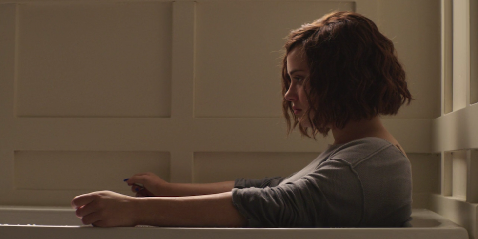
A good example of this phenomenon is the Netflix Original Show 13 Reasons Why. Although a fictional show, it is popular with the younger audience of teens and tweens and hits many of the benchmarks for inaccurate and dangerous reporting/viewing of suicide. 13 Reasons Why follows the story of the recently deceased protagonist, Hannah, who gives 13 tapes to different people who are responsible in some way for her suicide. The show has a confronting suicide scene on the last episode of the show, where Hannah is physically seen in the bathtub, slitting her wrists as blood comes out. This scene was intended to be graphic to ‘shock’ viewers, as it was a drama series, and it did. The problem it raises that it is the exact opposite of the recommended action to take when showing graphic suicides. According to ACMA, showing the actual suicide can make people with depression even more unstable and confused, and the recommended way to show it is not showing any graphic details at all.

The APC recommends that they ‘balance the public interest with the sensibilities of their readers, particularly when the material, such as photographs or videos, could reasonably be expected to cause offence’. The scene was graphic and could have definitely caused offense and shock to people watching the show. Also using non-sensationalistic descriptions to describe the death, can help mitigate suicides. However, the show took the route to make Hannah out to be the martyr. One of the faults of the show was that suicide is assumed to be a cause-and-effect action, when it can in fact come from of a number of issues, such as biochemical, genetic or even personality. In the show it is portrayed as the other people’s ‘fault’, when it is something an individual person decides for themselves.

Hannah’s scene in the bathtub, just before she commits suicide by slitting her wrists

The shows questionable take on suicide and grief has led to suicide rates spiking after the airing of the show in April with the 10-17 age demographic experiencing the highest suicide rate in the past 5 years and has only kept rising. The suicide rates in April can possibly be associated with the ending of 13 Reasons Why and have caused a suicide contagion among the youth due to its popularity.

How to Report Suicides Ethically

The main industry body for Australian TV regulations

There are recommendations from Industry Guidelines and Mental Health Professionals that give specific instruction on how to report on suicides.

From the APC and ACMA we have guidelines that tell journalists to-

  • Report it ethically so that the public can benefit from learning about the suicide
  • The death is clearly in the public interest
  • No authority has withheld reporting to prevent further incidents
  • Reports should not sensationalise, glamorise or trivialise suicides.
  • Have sensitivity and moderation in reporting/ showing suicide
  • Excluding details about death, method used or location.
  • Should be accompanied by helplines and 24-hour crisis line information.
  • Use words like “non-fatal” rather than “unsuccessful” and “increasing rates” rather than “suicide epidemic” to describe an attempt.
  • Don’t use derogatory terminology like “cracked up” or “psycho” that perpetuate discrimination and use medical terms with proper context

From Mental Health Professionals we have recommendations to-

  • Talk about their life, not death
  • Use neutral photos and passive voice
  • Look at context for the story if you’re reporting it
  • Include information of warning signs of suicide
  • Don’t assume correlation and causation for death

Afterthoughts of Ethical Reporting

Looking at this list, we can see that 13 Reasons Why clearly did not pass industry guidelines for reporting or showing suicide. It is very likely that the final episode of 13 Reasons Why would not be allowed to be shown on Australian TV. The mandatory 24-hour crisis line would also have to be shown at the end of each episode, which is what the show did not do and only included a warning about the themes and content on the first episode. They also showed explicit details on the method of death, as well as showing the impact. Another disturbing facet is that it also glamourizes suicide- by leaving the impression that people left behind would remember her legacy and change their ways.

Ethical suicide reporting and TV show standards set by ACMA on Australian TV would allow none of this- and the practical implications for this are very clear, to reduce the rise of suicide contagion and lessen the potential deaths to vulnerable people.

If you need help, an Australian suicide prevention hotline is here 24/7-

13 11 14

Lifeline Australia

Media Blog, VCD101

Typography is a hidden tool of manipulation within society

“Typography is a hidden tool of manipulation within society.”

The designer- Neville Brody

About the Artist, Neville Brody- we need context to establish this quote in. Neville Brody was born in 1957 and is a British graphic designer and typographer. He did a BA in Graphics and his early work was inspired by the emerging punk rock scene. Once out of University, his name was popularised by his art direction on a magazine called “The Face” and completely changed the aesthetic of the times. He later sold a book on his graphic design work, which was very popular.

This all relates back to his quote, which is ‘Typography is a hidden tool of manipulation within society’. His success in the art industry and typography in general have made him a renowned figure, and his quote is speaking from experiences he’s had with selling his works and getting people interested in how to formulate typography. While on ‘The Face’ magazine, he played with the composition and typography of letters, and the new designs allowed him to ‘manipulate’ or entrance readers to buy the magazine for the front covers alone.

One of Neville’s works, ‘Free me from Freedom’

What it means to me is very different, and of course, depends on the individual person viewing the quote or work. What it means is that in typography, the typefaces and setting can mean everything. It can convey sadness, anger, happiness. Hell, even this font is conveying an emotion to you. There are groups of typefaces that can exude a particular feel, and can be used very well. For example, sans-serif fonts can feel businesslike or strict, while modern serif fonts can appear more decorative and free. There are some more obvious ones, like Monospaced, which is an imitation of the Typewriter and looks robotic as well as antique. The point is, typography can influence what you think about the text in subtle ways, and can manipulate the reader into thinking or leaning towards an opinion that suits the typeface. Even when reading a book, personally I prefer some typefaces more than others and the typefaces I don’t like, I am much less likely to read the book.

It is called a hidden tool of manipulation because many people do not realise the value of typography in everyday life, when it consumes them on a daily basis, everything from the soap you buy, to election ballots, to movie titles. There are an endless list of possibilities to encounter the typography, since written text is ingrained to our society.

Brody goes so far as to call it a ‘manipulation’ but not in the evil sense of the world. It is more the subtle changing of environment, or text layout, or font that can shift your mood ever so slightly. This manipulation is small, but can catch on with the rest of society in a big way. For example, we all recognise the Comic Sans Font. There have been lots of uses of the font, and discussion on how ‘ugly’ the font is on internet forums and social media. This discussion by society led to almost everyone disliking the font and it unanimously standing for a representation of a ‘bad font’. Ironically, it is a very good font for dyslexia readers as the word is weighted just enough that they stay grounded. I only use the “Typography is a hidden tool” portion for my booklet as it is shorter and allows more space to play around. To sum up, typography is extremely important in the world around us, and allows us to subtly influence what people are thinking, and attracting attention when we need it.

Uncategorized

Monograms over history

How has practice of using a Monogram changed over time?

King Leo 1’s Monogram

This is a Monogram of King Leo I, a Roman Emperor. They would use it as symbols carved into coins and as representative of him as an Emperor. This symbol would be used to exert power and be used for armour, swords, pottery etc, to brandish the symbol of the Emperor. The importance of this symbol was big, and using this symbol meant that you either lived in or worked for the Emperor in some form. If rivals were caught wearing it, it could signify if they were a friend or an enemy. The mark was to be distinctive from each emperor to know who it was. It can also be used to brand slaves in the property of the kingdom and suggest ownership. It was used for coins, and each coin would have the monogram on it, and even go so far as only the coins with the monogram symbol engraved on it would be legal tender. In the case of Leo I, he adopted this monogram of his name, consisting of the Alphabet and other lines. The monogram itself is quite complex, consisting of 11 lines to draw, including the circle. It is still distinguishable from other Roman Emperors symbols, but runs the risk of not being immediately recognisable at first glance.

The iconic Chanel logo

An example of a modern monogram would be the Chanel Logo. In the modern space, it represents something very different, and a power of a different kind. This logo represents the brand Chanel, and is a signature on any of its apparel, whether on the tag or stamped on it. In the fashion marketplace, a monogram is the easiest way to stand out from the crowd. A simple, but distinctive design like this will have people associating this monogram with the brand and this marketing serves for people to remember the brand. When people remember the monogram for a brand, they will remember what the brand and what it stood for. As a monogram, it is very simplified, consisting of two interlocking C’s facing away from each other. There is only one shape duplicated twice and arranged back to back to create this monogram, which is very simple.

An example of different Roman Emperor Monograms

Using a monogram has changed a lot over time. The original usage was for Roman Emperors, kings, and merchants to use as an identifying symbol of power and respect. Nowadays, it is still a representation of power in modern culture, but of the commodity sort. Popular brands are recognised based on symbols alone, and allow for a recognisable brand. Monogram usage is more geared towards label recognition, and establishing a reliable persona for the public to take interest in. The use of it is more casual, but the designs are more refined and simplified due to the abundance of signs and monograms in the modern world. The advancement of technology also plays a role, with the modern ones being more clearer and defined, due to computer availability and file exchanges, historical figures didn’t have the luxury, and everything had to be hand-crafted with varying degrees of success.

Whereas the ancient use of monograms being engraved on everything from swords to armour to be recognisable, that is not the case today. The use of military monograms on uniforms and modern warfare is almost non-existent. Warfare has also changed to be a more subtle affair with spying and surveillance taking priority, and the very last thing to do would be to slap a recognisable monogram on those objects or people. It has moved from state matters to more commercial matters of selling than in the past.

Monograms as a whole are recognisable and an integral part of society nowadays. Visual Communication is the first thing people look at when shopping for a product. It is the most recognisable aspect for the brand at a first glance.